People & Purpose
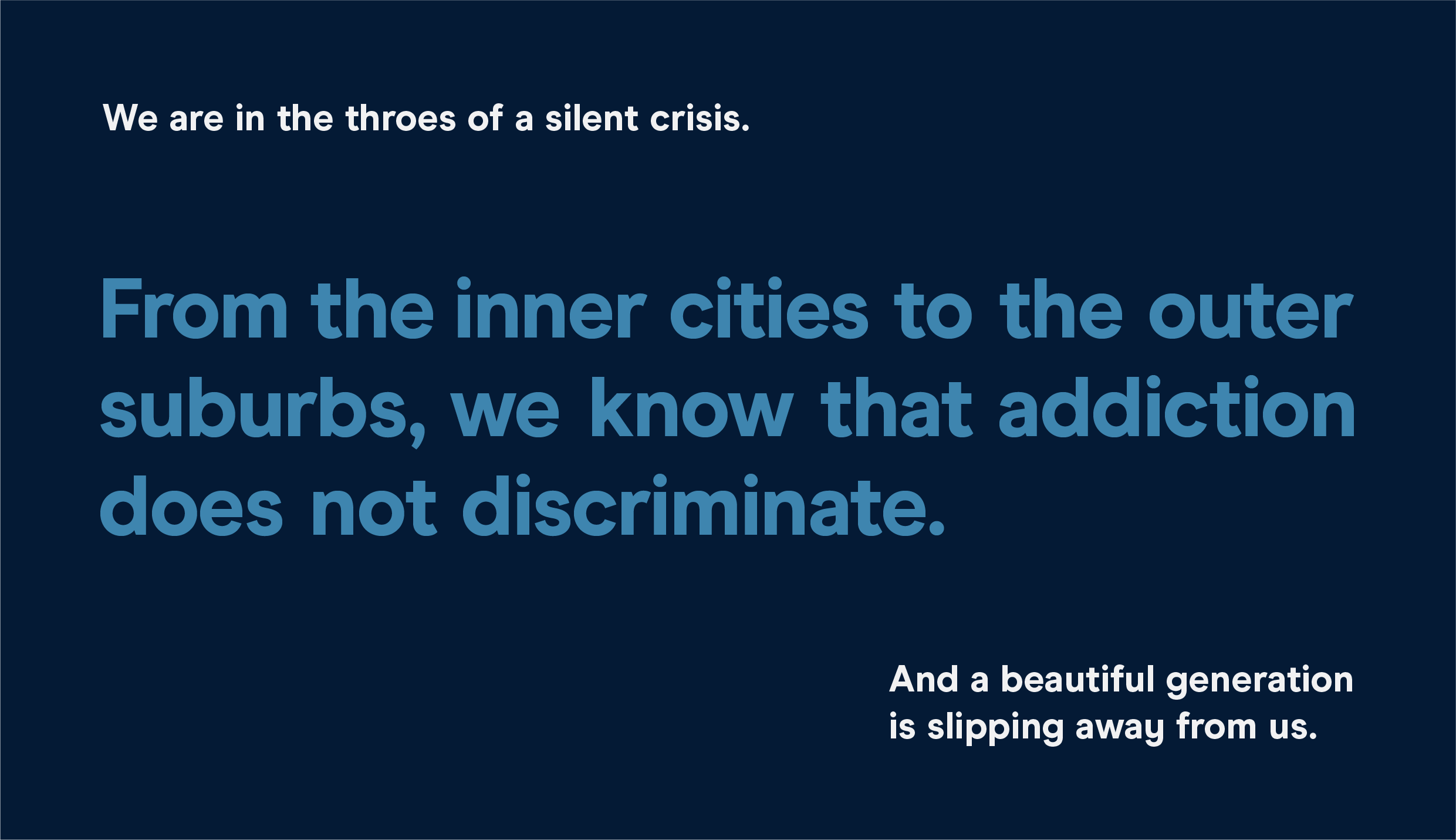
One in ten teenagers struggles with addiction. The largest sober high school in the country, Archway Academy brings together teens from every background imaginable to create a fellowship forever united by one goal: recovery. Instead of returning students to the same environments in which they’re most at risk for relapse—or where it’s nearly impossible to catch back up academically after treatment—Archway provides a structured place for teens to continue both their recovery and their education without compromising either.
Services
- Brand Strategy
- Verbal Identity
- Visual Identity
- Writing
- Website Design
- Print System
- Presentation Materials
- Video Script & Art Direction
Partners
- Kudos NYC
- Designed by Shea
- Philip Conrad
Left Image + Right Caption
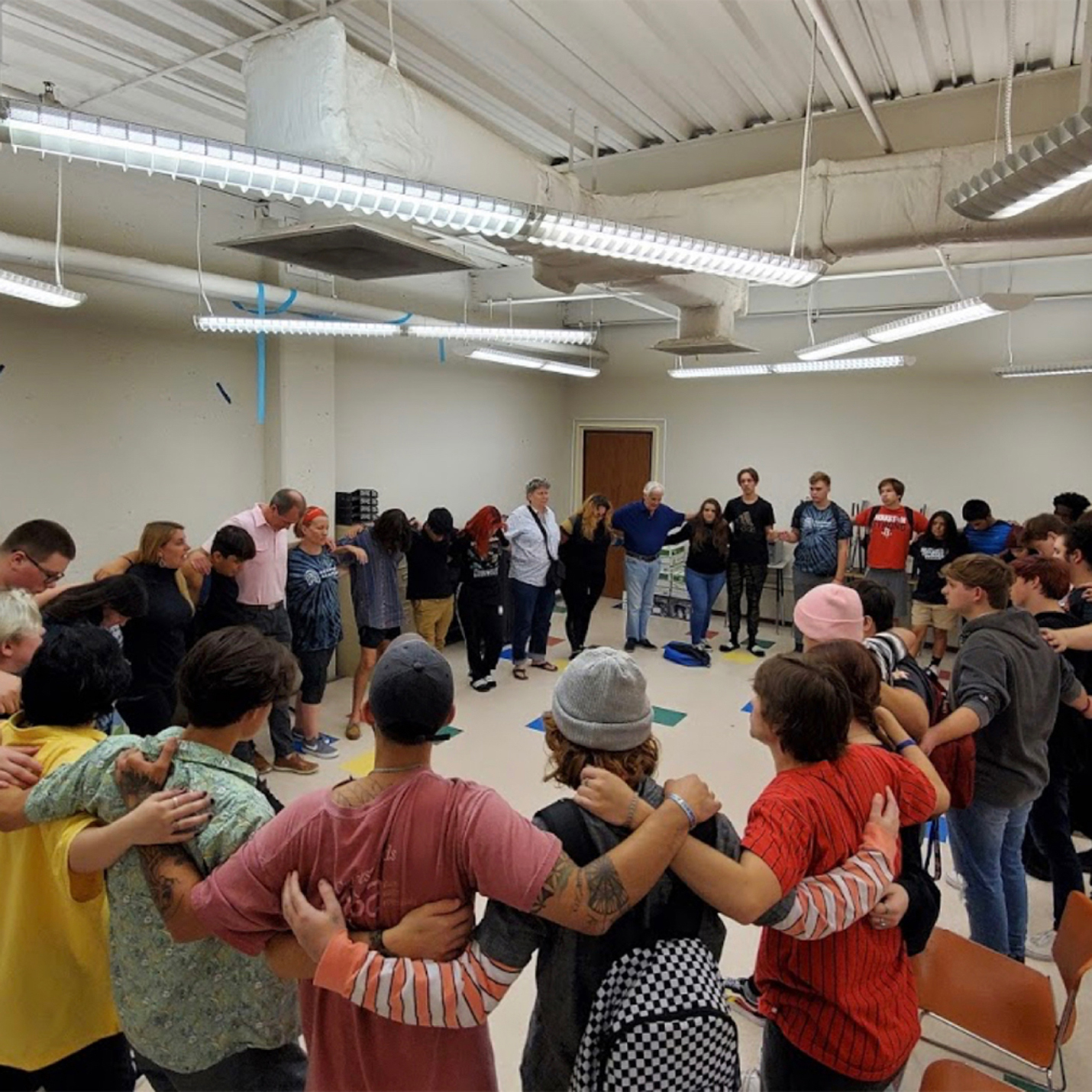
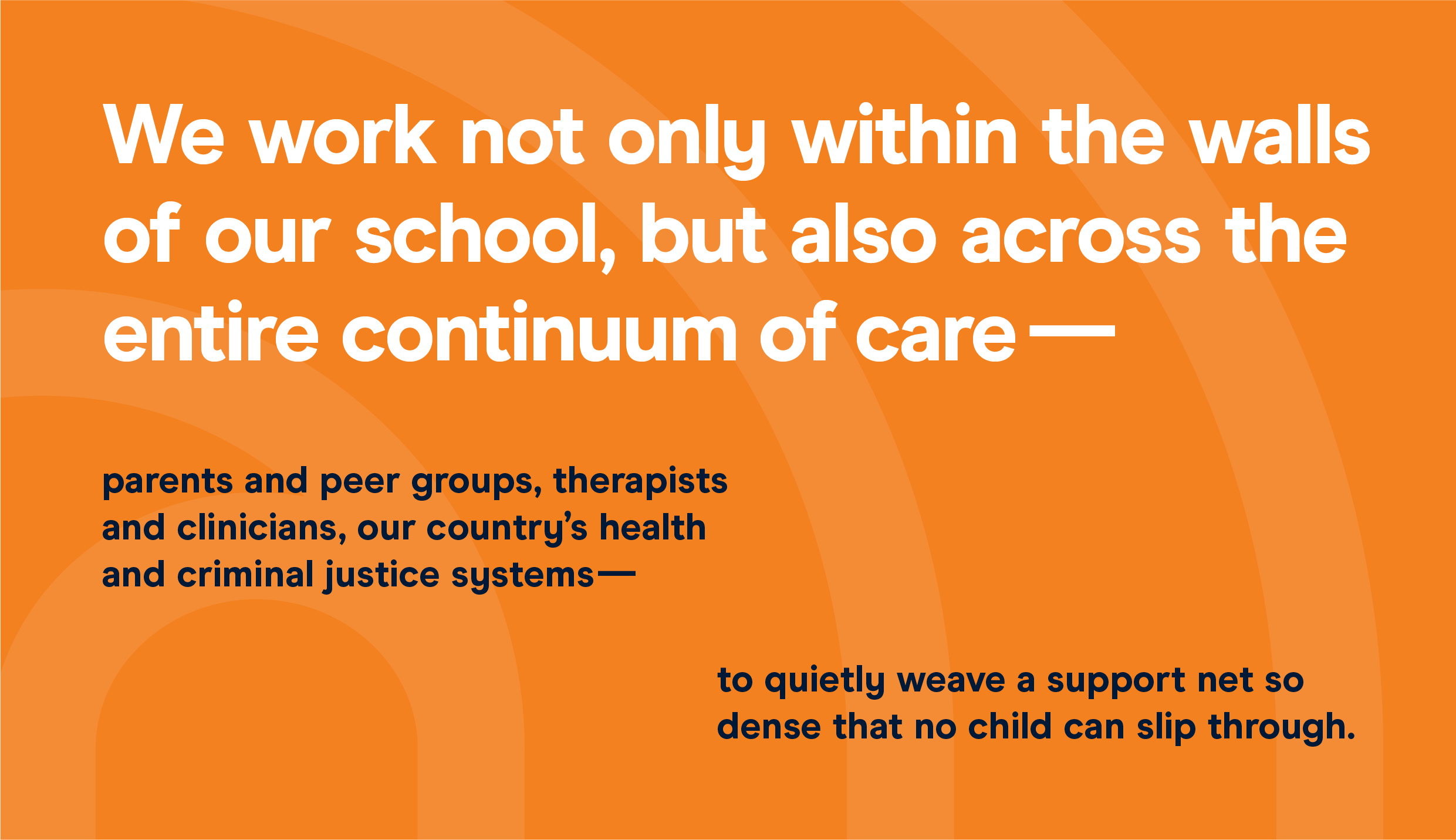
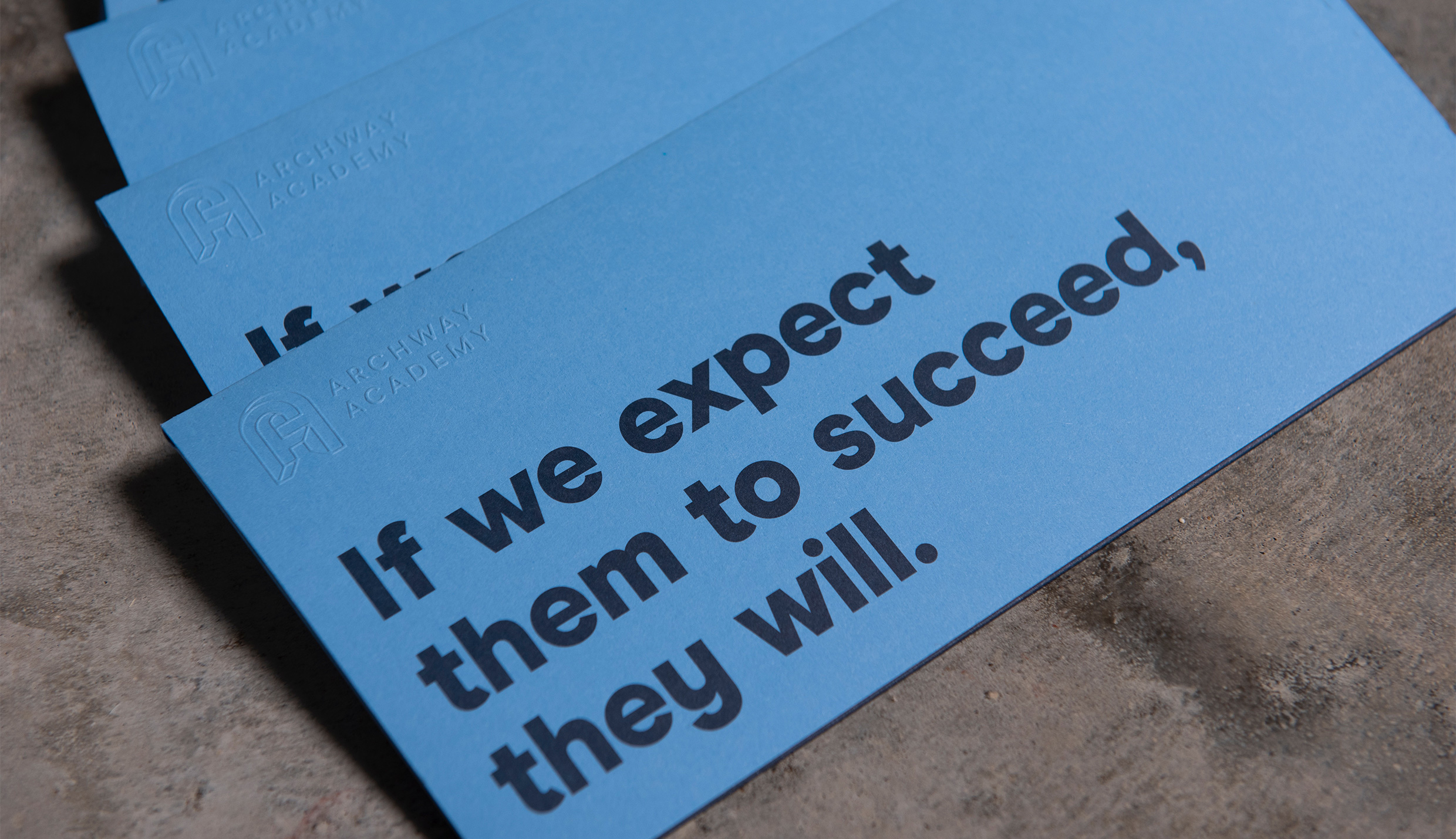
This circle is where we started. The Archway model is brilliant, but its people are magic. For those without the benefit of talking to their Executive Director, educators, coaches, and the students themselves—witnessing firsthand the rawness, the warmth, the work, even the humor—credibility was paramount for reaching anxious parents and skeptical teens looking for a way through the thorny landscape of recovery. Hope starts with trust, and Archway needed a voice.
Slideshow + Caption
1
of
5
Single Image + Caption
Text
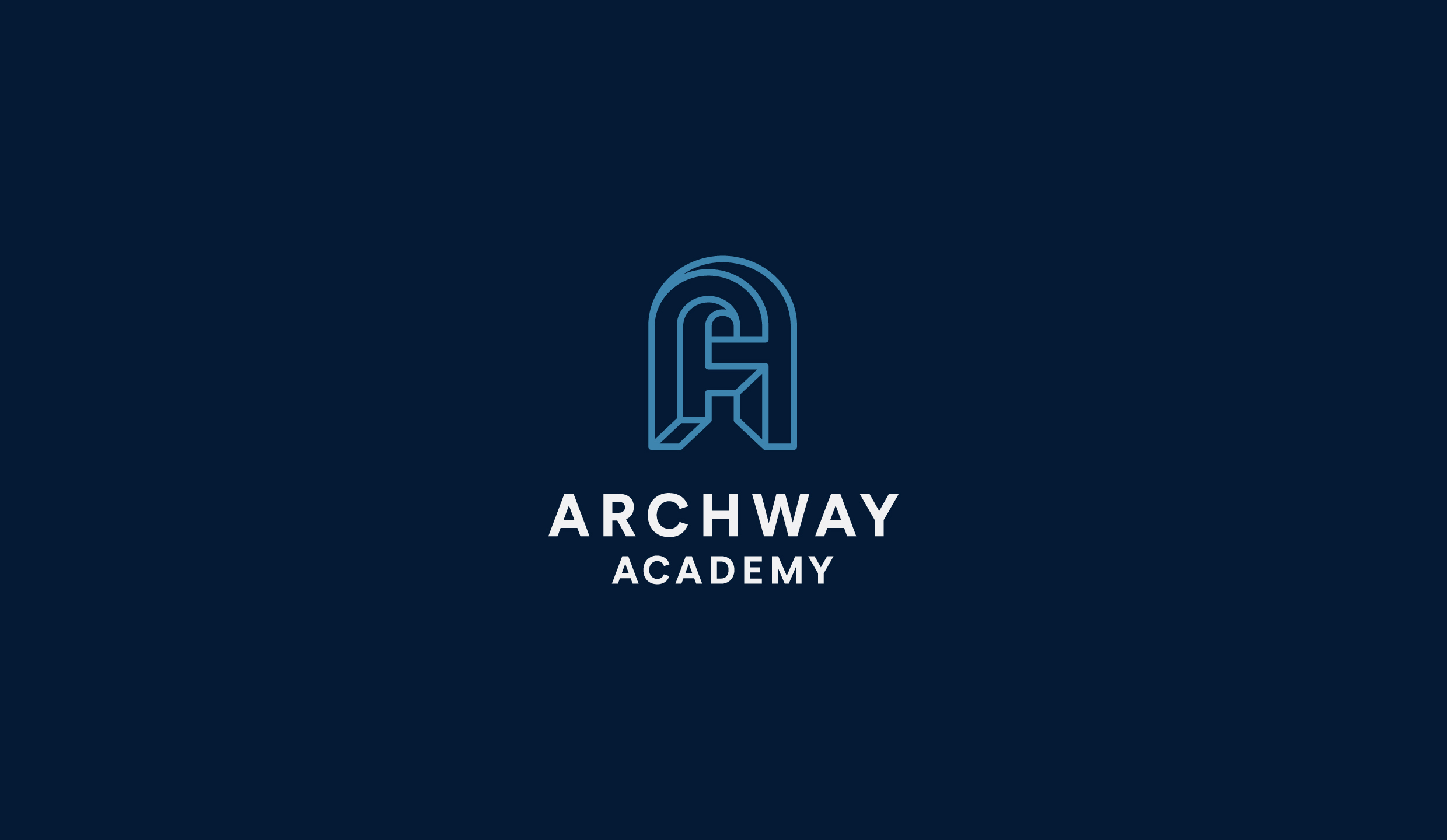
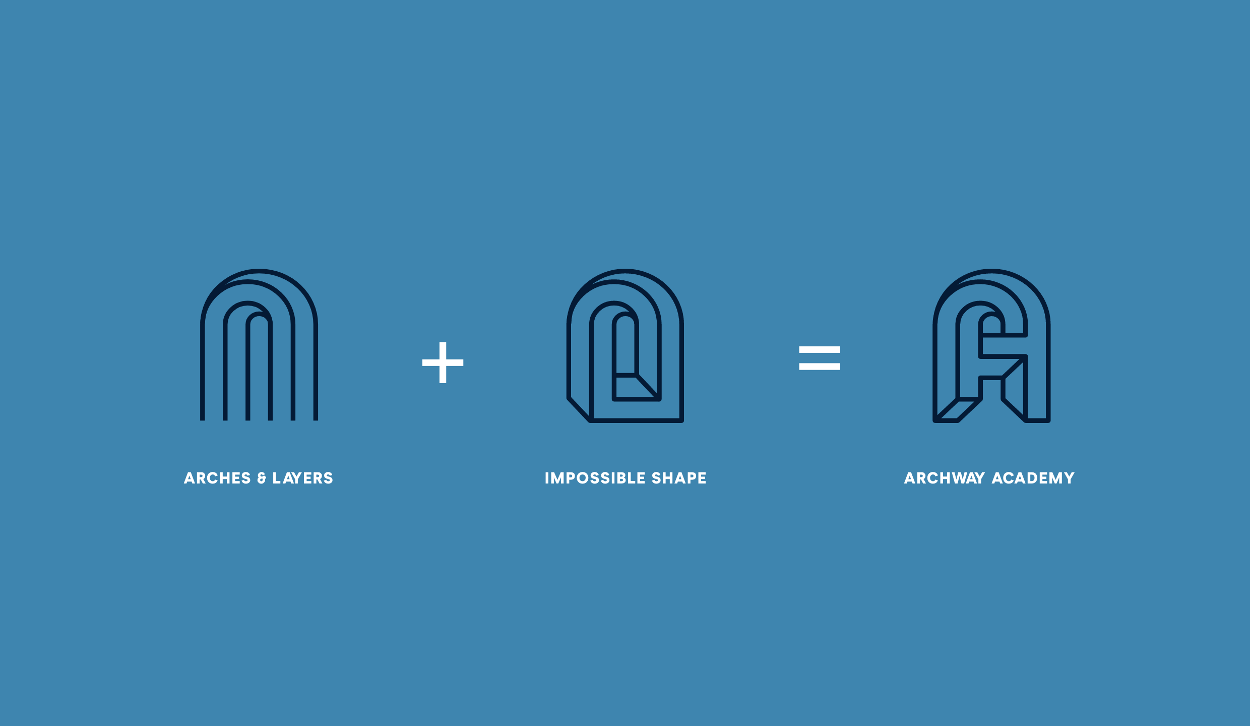
Archway’s new symbol represents the circuitous challenges of addiction and the assumptions people make of the teens in recovery—that they are unruly, lost causes, and impossible to deal with. With its Escher-like design, the “impossible embrace” symbolizes an individual worth taking a deeper look at: the heart of Archway’s approach. Surrounding students with support and understanding. Loving them at their lowest in order to lift them to their highest.
Slideshow + Caption
1
of
2
Single Image + Caption
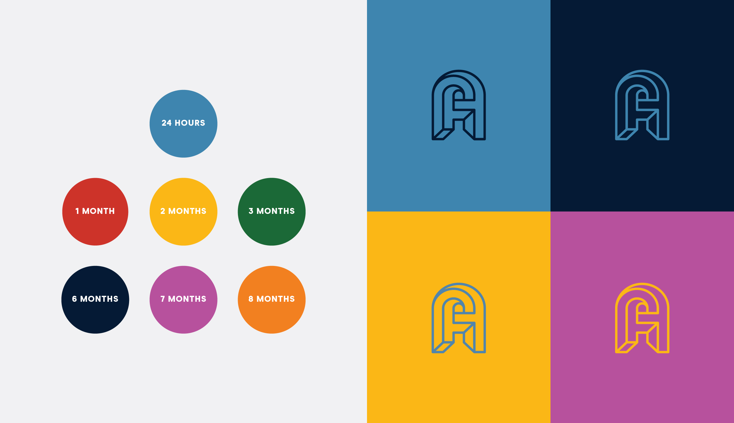
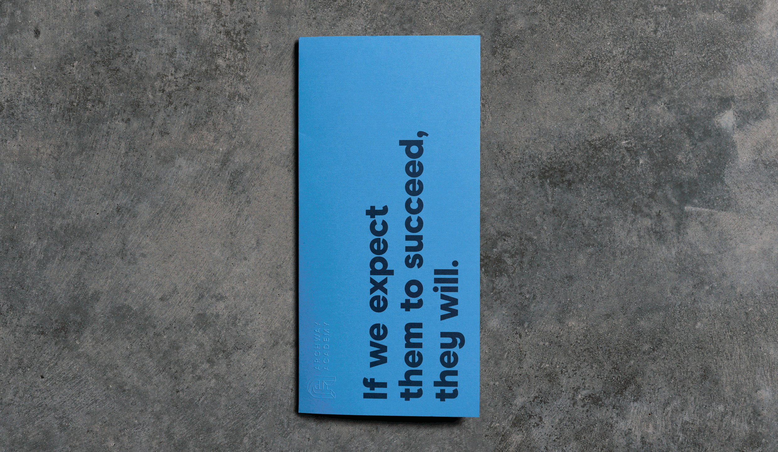
Inspired by sobriety chips, Archway’s master color is the 24-hour chip—a soft gray-blue—to reflect the delicacy and frailty of a student beginning their journey, one day, sometimes one hour, at a time.
Single Image + Caption
Text
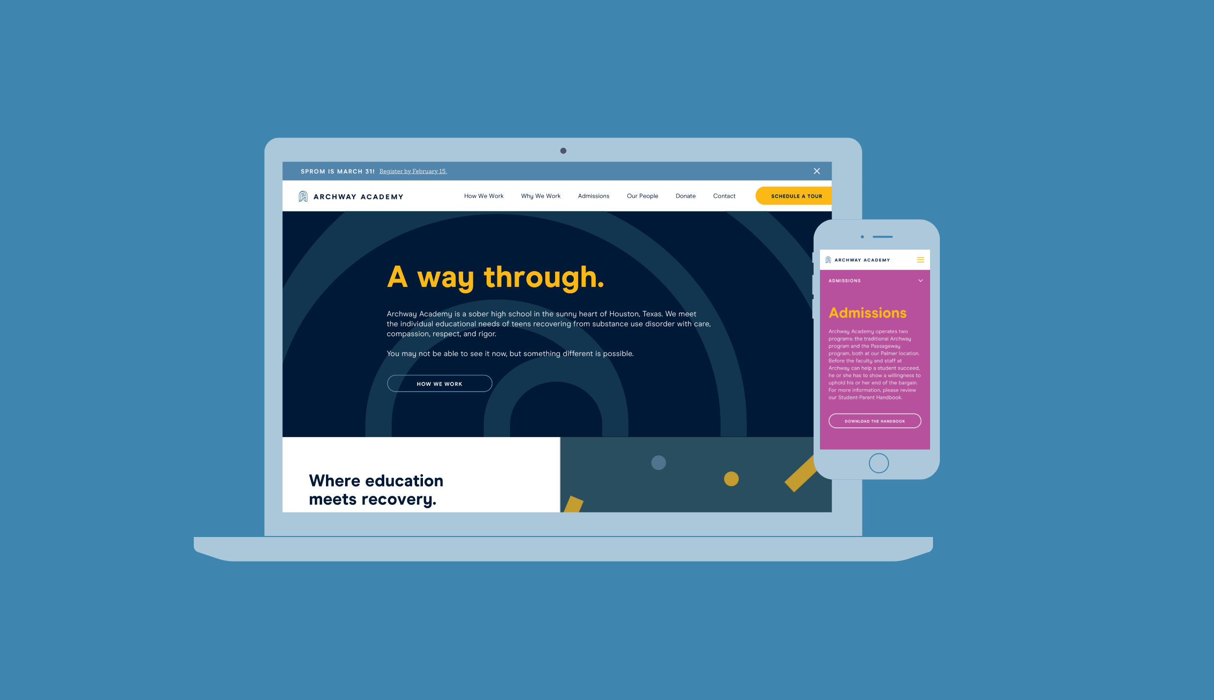
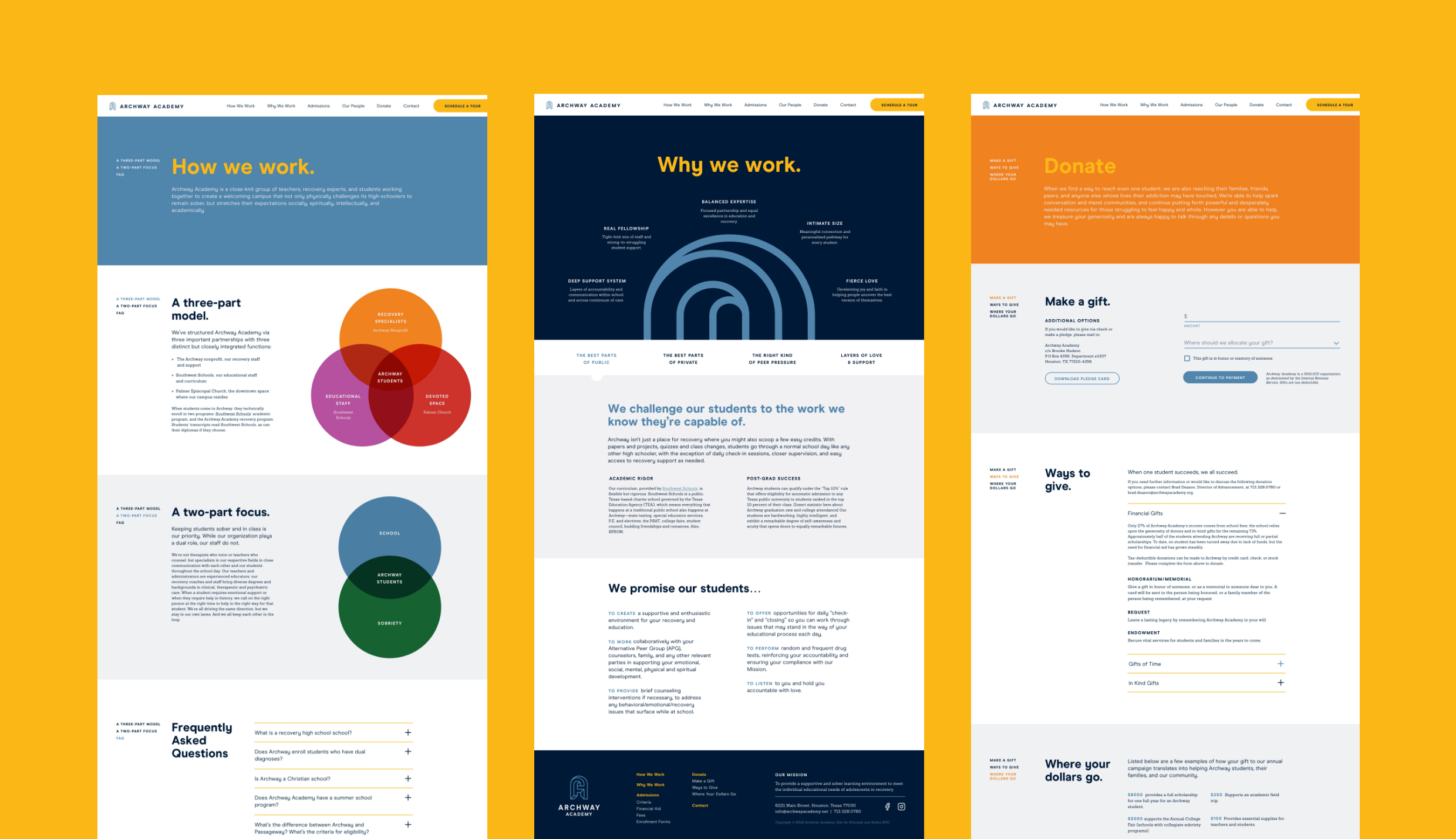
It was important that the brand reflect Archway’s students, but most of these teens aren’t exactly clamoring to get into sobriety school. The program’s primary audience is the decision-makers—frightened, panicky, worn-out parents and caregivers desperate for help. The website serves as a hardworking tool to hit people fast with the hope and the “how” they’ve been searching for.
Single Image + Caption
Single Image + Caption
Small + Large Image
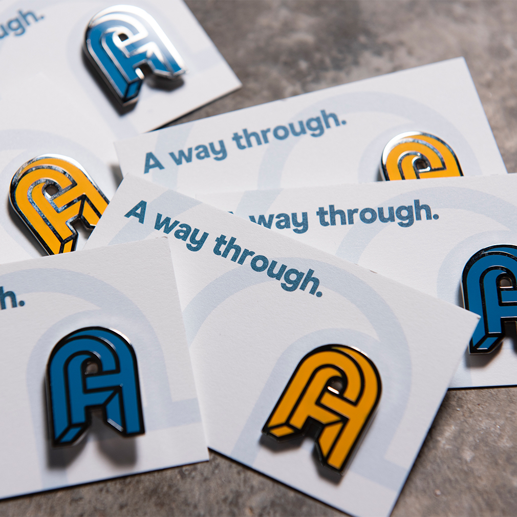
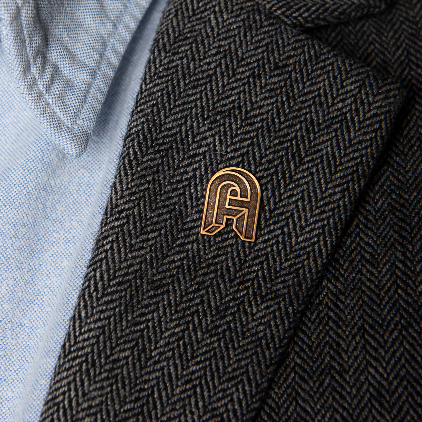
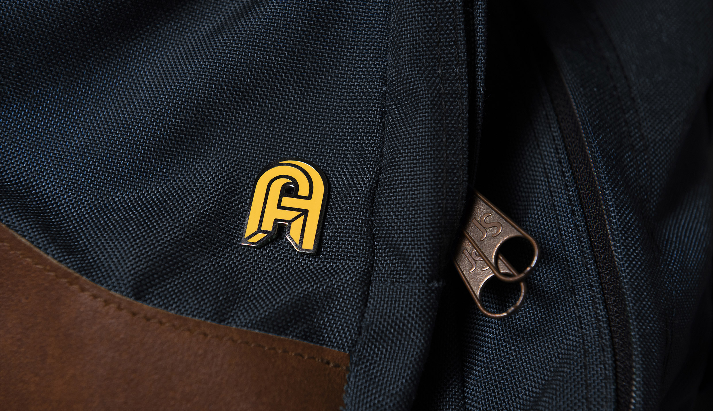
Colored pins for students and staff; bronze pins for board members.
Text
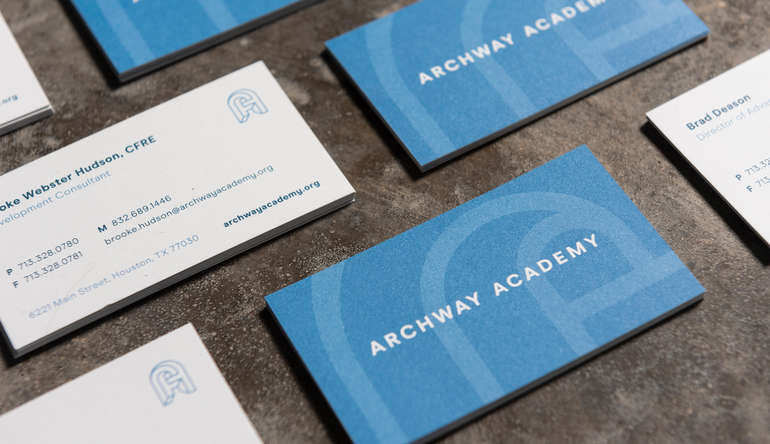
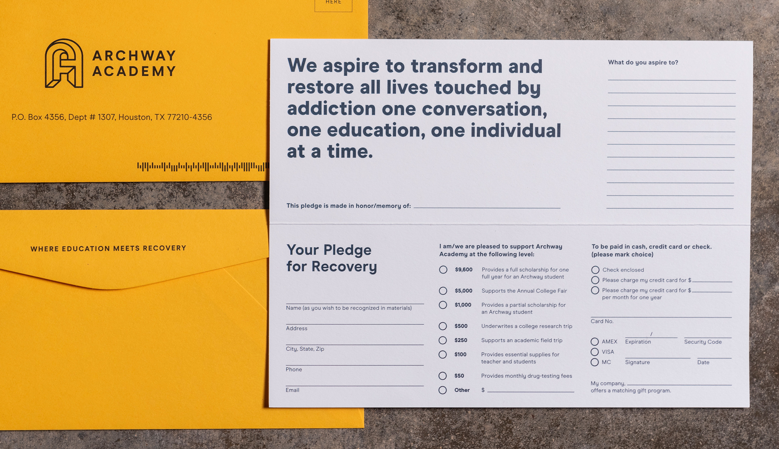
As a nonprofit, Archway relies heavily on its board of directors and donors to sustain and champion its program. Whether through their website, presentation materials, or a simple, eye-catching pin, a polished suite of tools helps them raise money and awareness with confidence.
Single Image + Caption
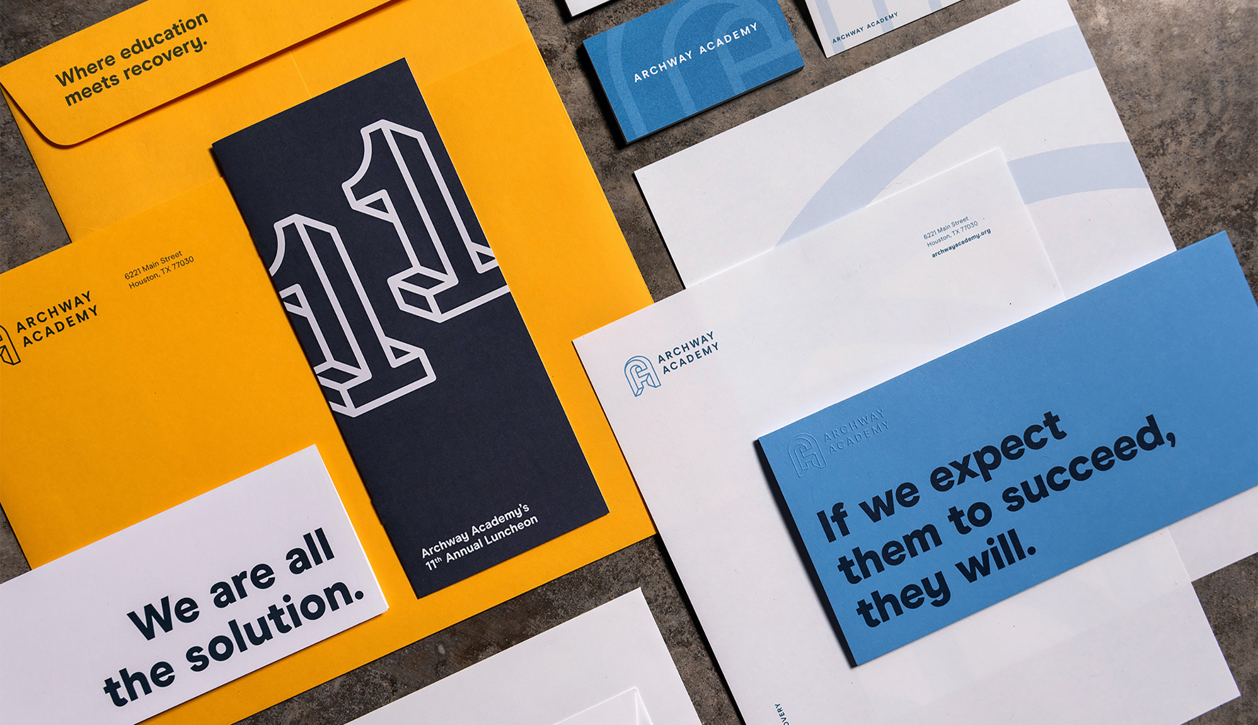
Single Image + Caption
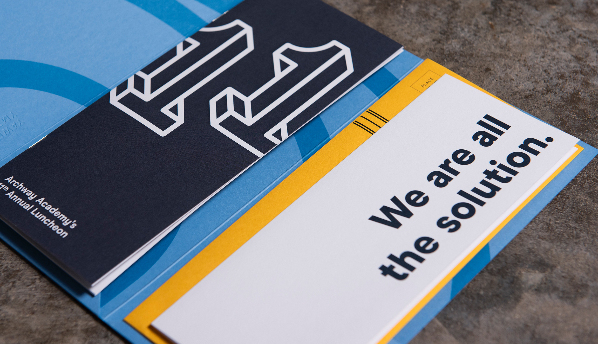
Custom brochure system created for Archway Academy’s 11th Annual Luncheon.
Slideshow + Caption
1
of
3
Single Image + Caption
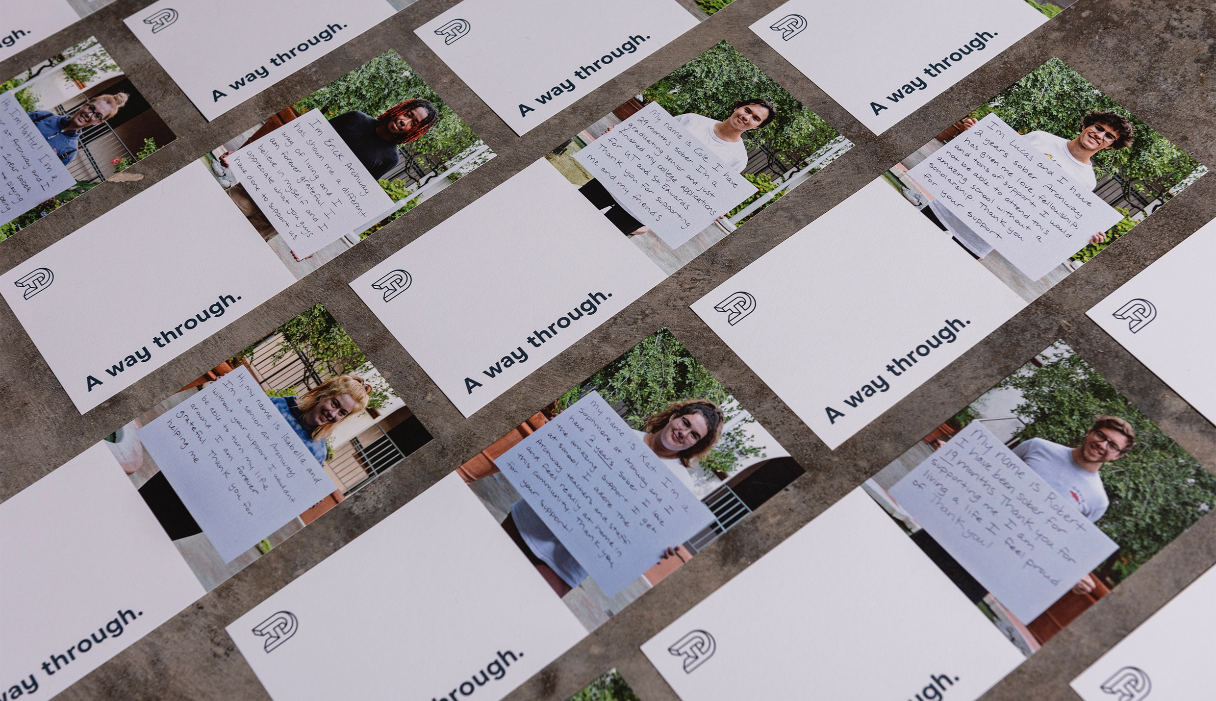
Text
Materials (like above) where students share smiling stories of success and sobriety are the very best kind. But we learned the path to recovery looks different for everyone, and it’s often a long, non-linear process. For this reason—coupled with the reality of a nonprofit with a finite budget in need of evergreen materials—Archway’s brand remains mostly graphic vs. photographic. In the end, since we couldn’t use their faces, we launched their brand with a video using what resonated with us most from Day One: their voices.
Single Image + Caption
At their annual fundraising luncheon, Archway unveiled their rebrand with a motion graphics piece we designed and scripted from their brand manifesto. The video remains on their homepage as a welcoming overview for prospective students and their families.
Text
I wanted to let you know that we set a new record for donations collected at the event, our highest ever… and we raised a whopping $235,440 total! This is truly amazing. I have received several compliments on the video, rebranding, student stories, speaker… The foundation rep from our largest donor pulled me aside on the way out and said, “Every year I think it is my favorite, but this really is it. This place just touches your soul.”